Appendix A - Widgets
Introduction
The symfony form framework comes bundled with a lot of useful widgets. These
widgets cover the common needs of most projects. This chapter describes the
default form widgets bundled with symfony. We have also included some of the
form widgets from the sfFormExtraPlugin, sfPropelPlugin, and
sfDoctrinePlugin plugins, as these plugins are supported by the core team
and contain some very useful widgets.
tip
Even if you don't use the symfony MVC framework, you can use the widgets
defined in the
sfFormExtraPlugin,
sfPropelPlugin, and sfDoctrinePlugin plugins by putting the widget/
directories somewhere in your project.
Before diving into each widget details, let's see what widgets have in common.
The sfWidget Base Class
All symfony widgets inherit from the sfWidget base class, which provides
some default features available to all widgets.
By default, all widgets are rendered as XHTML. You can switch to HTML by
calling the setXhtml() method:
sfWidget::setXhtml(false);
The widget system also automatically takes care of escaping HTML attributes and
sensible content. To be effective, it needs to know the charset used by your
project. By default the charset is UTF-8, but it can be configured by
calling the setCharset() method:
sfWidget::setCharset('ISO-8859-1');
note
If you use the symfony widgets with the symfony MVC framework, the charset is
automatically set according to the charset of settings.yml.
If a widget depends on some JavaScript files and/or stylesheets, you can
override the getJavaScripts() and getStylesheets() methods respectively:
class Widget extends sfWidget
{
  public function getStylesheets()
  {
    // the array keys are files and values are the media names
    // separated by a colon (,)
    return array(
      '/path/to/file.css' => 'all',
      '/another/file.css' => 'screen,print',
    );
  }

  public function getJavaScripts()
  {
    return array('/path/to/file.js', '/another/file.js');
  }
}
The sfWidgetForm Base Class
In this section, we will only talk about form widgets. All of them inherit
from the sfWidgetForm base class, which extends the sfWidget class to
provide some extra default features.
When creating a widget, you can optionally pass options and HTML attributes as arguments:
$w = new sfWidgetFormInputText(
  array('default' => 'Fabien'),
  array('class' => 'foo')
);
Options and HTML attributes can also be set by using the setOptions() and
setAttributes() methods:
$w = new sfWidgetFormInputText();
$w->setOptions(array('default' => 'Fabien'));
$w->setAttributes(array('class' => 'foo'));
The setOption() and setAttribute() methods allows to set an individual
option or HTML attribute:
$w = new sfWidgetFormInputText();
$w->setOption('default', 'Fabien');
$w->setAttribute('class', 'foo');
A widget can be rendered by calling the render() method:
$w->render('name', 'value', array('class' => 'foo'));
The render() method takes the following arguments:
- The name of the widget
- The value of the widget
- Some optional HTML attributes (these are merged with the default ones defined at construction time)
note
Widgets are stateless which means that a single widget instance can be rendered as many times as you want with different arguments.
The above widget renders as follows:
<input class="foo" type="text" name="bar" id="bar" value="value"/>
The default options defined by sfWidgetForm are the following:
| Option | Description |
|---|---|
is_hidden |
true if the form widget must be hidden, false otherwise (false by default) |
needs_multipart |
true if the form widget needs a multipart form, false otherwise (false by default) |
default |
The default value to use when rendering the widget |
label |
The label to use when the widget is rendered by a widget schema |
id_format |
The format for the generated HTML id attributes (%s by default) |
note
The is_hidden option is used by widget form schema classes to render hidden
widgets without decoration. The needs_multipart option is used by the form
classes to add an enctype="multipart/form-data" attribute when rendering a
form tag.
The sfWidgetForm class also provides accessor methods for all the options:
is_hidden:isHidden(),setHidden()needs_multipart:needsMultipartForm()default:getValue(),setValue()label:getLabel(),setLabel()id_format:getIdFormat(),setIdFormat()
Widget Schema
A form widget schema is a wrapper widget for one or several other widgets.
In the next sections, the widgets have been regrouped into categories.
Widgets
sfWidgetFormChoicesfWidgetFormDatesfWidgetFormDateRangesfWidgetFormDateTimesfWidgetFormDoctrineChoicesfWidgetFormFilterInputsfWidgetFormFilterDatesfWidgetFormI18nChoiceCountrysfWidgetFormI18nChoiceLanguagesfWidgetFormI18nChoiceCurrencysfWidgetFormI18nChoiceTimezonesfWidgetFormI18nDatesfWidgetFormI18nDateTimesfWidgetFormI18nTimesfWidgetFormInputsfWidgetFormInputCheckboxsfWidgetFormInputFilesfWidgetFormInputFileEditablesfWidgetFormInputHiddensfWidgetFormInputPasswordsfWidgetFormJQueryAutocompletersfWidgetFormJQueryDatesfWidgetFormPropelChoicesfWidgetFormReCaptchasfWidgetFormSchemasfWidgetFormSchemaDecoratorsfWidgetFormSelectsfWidgetFormSelectDoubleListsfWidgetFormSelectManysfWidgetFormSelectCheckboxsfWidgetFormSelectRadiosfWidgetFormTextareasfWidgetFormTextareaTinyMCEsfWidgetFormTime
Input Widgets
sfWidgetFormInput
The input tag is probably the simplest form tag you will ever use and is
represented by the sfWidgetFormInput class.
| Option | Description |
|---|---|
type |
The value of the HTML type attribute (text by default) |
$w = new sfWidgetFormInputText();
echo $w->render('foo');

# <input type="text" name="foo" id="foo" />
sfWidgetFormInputCheckbox
The sfWidgetFormInputCheckbox is an input widget with a type of
checkbox.
$w = new sfWidgetFormInputCheckbox();
echo $w->render('foo');

# <input type="checkbox" name="foo" id="foo" />
sfWidgetFormInputHidden
The sfWidgetFormInputHidden is an input widget with a type of hidden.
The is_hidden option is also set to true.
$w = new sfWidgetFormInputHidden();
echo $w->render('foo');

# <input type="hidden" name="foo" id="foo" />
sfWidgetFormInputPassword
The sfWidgetFormInputPassword is an input widget with a type of
password.
$w = new sfWidgetFormInputPassword();
echo $w->render('foo');

# <input type="password" name="foo" id="foo" />
sfWidgetFormInputFile
The sfWidgetFormInputFile is an input widget with a type of file. The
needs_multipart option is automatically set to true.
$w = new sfWidgetFormInputFile();
echo $w->render('foo');

# <input type="file" name="foo" id="foo" />
sfWidgetFormInputFileEditable
The sfWidgetFormInputFileEditable is an input file widget, extending the
sfWidgetFormInputFile widget to add the possibility to display or remove a
previously uploaded file.
| Option | Description |
|---|---|
file_src |
The current image web source path (required) |
edit_mode |
A Boolean: true to enabled edit mode, false otherwise |
is_image |
Whether the file is a displayable image |
with_delete |
Whether to add a delete checkbox or not |
delete_label |
The delete label used by the template |
template |
The HTML template to use to render this widget |
| The available placeholders are: | |
* input (the image upload widget) |
|
* delete (the delete checkbox) |
|
* delete_label (the delete label text) |
|
* file (the file tag) |
caution
In the edit mode, this widget renders an additional widget named
after the file upload widget with a "_delete" suffix. So, when creating
a form, don't forget to add a validator for this additional field.
sfWidgetFormTextarea
The sfWidgetFormTextarea widget automatically set default values for the
rows and cols HTML attributes as they are mandatory.
$w = new sfWidgetFormTextarea();
echo $w->render('foo');

# <textarea rows="4" cols="30" name="foo" id="foo"></textarea>
sfWidgetFormTextareaTinyMCE
If you want to render a WYSIWYG editor widget, you can use
sfWidgetFormTextareaTinyMCE:
$w = new sfWidgetFormTextareaTinyMCE(
  array(),
  array('class' => 'foo')
);
caution
This widget is part of the sfFormExtraPlugin symfony plugin.
As the TinyMCE JavaScript files are not bundled with the plugin, you must install it and include it by yourself.
| Option | Description |
|---|---|
theme |
The TinyMCE theme (advanced by default) |
width |
Width |
height |
Height |
config |
An array of specific JavaScript configuration |
Choice Widgets
Choice Representations
When you want the user to make a choice amongst a list of possibilities, HTML offers several way of representing the choice:
A
selecttag:
A
selecttag with amultipleattribute:
A list of
inputtags with atypeofradio:
A list of
inputtags with atypeofcheckbox:
But ultimately, they all allow the user to make a single or a multiple choice within a finite number of possibilities.
The sfWidgetFormChoice widget standardizes all these possibilities within
one widget. The widget is able to render a choice as any of the four HTML
representations we have seen above. It also lets you define your own
representation as you will see later on.
sfWidgetFormChoice is a special widget in the sense that it delegates the
rendering to another widget. The rendering is controlled by two options:
expanded and multiple:
expanded is false |
expanded is true |
|
|---|---|---|
multiple is false |
sfWidgetFormSelect |
sfWidgetFormSelectRadio |
multiple is true |
sfWidgetFormSelectMany |
sfWidgetFormSelectCheckbox |
note
The sfWidgetFormSelect, sfWidgetFormSelectMany,
sfWidgetFormSelectCheckbox, and sfWidgetFormSelectRadio widgets
used by sfWidgetFormChoice to render itself are plain widgets like
any other and can be used directly. They are not documented in this
section as most of the time, it is better to use the more flexible
sfWidgetFormChoice widget.
And here is the HTML representation for each possibility:
$w = new sfWidgetFormChoice(array(
  'choices' => array('Fabien Potencier', 'Fabian Lange'),
));

$w = new sfWidgetFormChoice(array(
  'multiple' => true,
  'choices'  => array('PHP', 'symfony', 'Doctrine', 'Propel', 'model'),
));

$w = new sfWidgetFormChoice(array(
  'expanded' => true,
  'choices'  => array('published', 'draft', 'deleted'),
));

$w = new sfWidgetFormChoice(array(
  'expanded' => true,
  'multiple' => true,
  'choices'  => array('A week of symfony', 'Call the expert', 'Community'),
));

Choices Grouping
The sfWidgetFormChoice widget has built-in support for groups of choices by
passing an array of arrays for the choices options:
$choices = array(
  'Europe'  => array('France' => 'France', 'Spain' => 'Spain', 'Italy' => 'Italy'),
  'America' => array('USA' => 'USA', 'Canada' => 'Canada', 'Brazil' => 'Brazil'),
);

$w = new sfWidgetFormChoice(array('choices' => $choices));
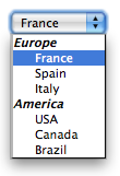
The expanded and multiple options also work as expected:
$w = new sfWidgetFormChoice(array(
  'choices'  => $choices,
  'expanded' => true,
));
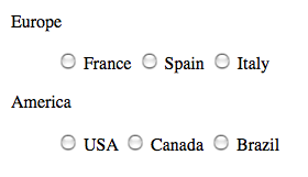
The layout used by the renderer widget can also be customized:
$w = new sfWidgetFormChoice(array(
  'choices'  => $choices,
  'expanded' => true,
  'renderer_options' => array('template' => '<strong>%group%</strong> %options%'),
));
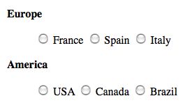
Here is some more example of option combinations:
$w = new sfWidgetFormChoice(array(
  'choices'  => $choices,
  'multiple' => true,
));

$w = new sfWidgetFormChoice(array(
  'choices'  => $choices,
  'multiple' => true,
  'expanded' => true,
  'renderer_options' => array('template' => '<strong>%group%</strong> %options%'),
));
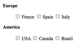
note
When the widget is rendered with a plain select tag, it uses the
standard optgroup tag.
Supported Options
Here is a list of all supported options for the widget:
| Option | Description |
|---|---|
choices |
An array of possible choices (required) |
multiple |
true if the select tag must allow multiple selections |
expanded |
true to display an expanded widget |
renderer_class |
The class to use instead of the default one |
renderer_options |
The options to pass to the renderer constructor |
renderer |
A renderer widget (overrides the expanded and renderer_options options) |
The choices option will be: new sfCallable($thisWidgetInstance, 'getChoices') |
The sfWidgetFormSelectCheckbox and sfWidgetFormSelectRadio widgets support
the following options:
| Option | Description |
|---|---|
label_separator |
The separator to use between the input checkbox/radio button and the label |
class |
The class to use for the main <ul> tag |
separator |
The separator to use between each input checkbox/radio button |
formatter |
A callable to call to format the checkbox choices |
| The formatter callable receives the widget and the array of inputs as arguments | |
template |
The template to use when grouping options in groups (%group% %options%) |
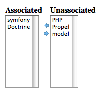
Double List Representation
When the user can select multiple options, it is sometimes better to show the list of selected options in another box.
The sfWidgetFormSelectDoubleList widget can be used to render a choice
widget as a double list:
$w = new sfWidgetFormChoice(array(
  'choices'        => array('PHP', 'symfony', 'Doctrine', 'Propel', 'model'),
  'renderer_class' => 'sfWidgetFormSelectDoubleList',
));
caution
This widget is part of the sfFormExtraPlugin symfony plugin.
note
This widget uses some custom JavaScripts to work. You can retrieve
their paths by calling the widget getJavaScripts() method:
$files = $w->getJavascripts();
| Option | Description |
|---|---|
choices |
An array of possible choices (required) |
class |
The main class of the widget |
class_select |
The class for the two select tags |
label_unassociated |
The label for unassociated |
label_associated |
The label for associated |
unassociate |
The HTML for the unassociate link |
associate |
The HTML for the associate link |
template |
The HTML template to use to render this widget |
The available placeholders are: %label_associated%, %label_unassociated%, %associate%, %unassociate%, %associated%, %unassociated%, %class% |
Autocomplete
When you want the user to make a selection amongst a lot of elements, listing
them all in a select box becomes impractical. The
sfWidgetFormJQueryAutocompleter solves this problem by converting a simple
input tag to an autocomplete select box.
caution
This widget is part of the sfFormExtraPlugin symfony plugin. As
JQuery and JQuery UI are not bundled with sfFormExtraPlugin, you need
to install and include them by hand.
$w = new sfWidgetFormChoice(array(
  'choices'          => array(),
  'renderer_class'   => 'sfWidgetFormJQueryAutocompleter',
  'renderer_options' => array('url' => '/autocomplete_script'),
));
note
This widget uses some custom JavaScripts and Stylesheets to work
properly. You can retrieve their paths by calling the widget
getJavaScripts() and getStylesheets() methods.
The url option is the URL the widget will call to populate the choices based
on the user input. The URL receives two parameters:
q: The string entered by the userlimit: The maximum number of items to return
The script must return a valid JSON representation of the choice array (use
the PHP built-in json_encode() function to convert an array to JSON).
| Option | Description |
|---|---|
url |
The URL to call to get the choices to use (required) |
config |
A JavaScript array that configures the JQuery autocompleter widget |
value_callback |
A callback that converts the value before it is displayed |
If the choices are related to a Propel model, the
sfWidgetFormPropelJQueryAutocompleter widget is optimized for foreign key
lookup:
$w = new sfWidgetFormChoice(array(
  'renderer_class'   => 'sfWidgetFormPropelJQueryAutocompleter',
  'renderer_options' => array(
    'model' => 'Article',
    'url'   => '/autocomplete_script',
  ),
));
| Option | Description |
|---|---|
model |
The model class (required) |
method |
The method to use to convert an object to a string (__toString() by default) |
Choice bound to a Propel Model
If the choices are bound to a Propel model (usually when you want to allow the
user to change a foreign key), you can use the sfWidgetFormPropelChoice
widget:
$w = new sfWidgetFormPropelChoice(array(
  'model'     => 'Article',
  'add_empty' => false,
));
The choices are automatically retrieved by the widget according to the
model class you pass. The widget is highly configurable via a set of
dedicated options:
| Option | Description |
|---|---|
model |
The Propel model class (required) |
add_empty |
Whether to add a first empty value or not (false by default) |
| If the option is not a Boolean, the value will be used as the text value | |
method |
The method to use to display object values (__toString by default) |
key_method |
The method to use to display the object keys (getPrimaryKey by default) |
order_by |
An array composed of two fields: |
* The column to order by the results (must be in the PhpName format) |
|
* asc or desc |
|
criteria |
A criteria to use when retrieving objects |
connection |
The Propel connection name to use (null by default) |
multiple |
true if the select tag must allow multiple selections |
peer_method |
The peer method to use to fetch objects |
Choice bound to a Doctrine Model
If the choices are bound to a Doctrine model (usually when you want to allow
the user to change a foreign key), you can use the
sfWidgetFormDoctrineChoice widget:
$w = new sfWidgetFormDoctrineChoice(array(
  'model'     => 'Article',
  'add_empty' => false,
));
The choices are automatically retrieved by the widget according to the
model class you pass. The widget is highly configurable via a set of
dedicated options:
| Option | Description |
|---|---|
model |
The model class (required) |
add_empty |
Whether to add a first empty value or not (false by default) |
| If the option is not a Boolean, the value will be used as the text value | |
method |
The method to use to display object values (__toString by default) |
key_method |
The method to use to display the object keys (getPrimaryKey by default) |
order_by |
An array composed of two fields: |
* The column to order by the results (must be in the PhpName format) |
|
* asc or desc |
|
query |
A query to use when retrieving objects |
connection |
The Doctrine connection to use (null by default) |
multiple |
true if the select tag must allow multiple selections |
table_method |
The method to use to fetch objects |
Date Widgets
Date widgets can be used to ease date entering by proposing several select boxes for a date, a time, or a date time. All symfony date widgets are represented by several HTML tags. They can also be customized according to the user culture.
note
Some people prefer to use a simple input tag for dates because users can
enter dates faster by avoiding all the select boxes. Of course, the date
format is enforced on the server side by a validator. Thankfully, the symfony
date validator proposes a powerful validator which is very liberal in what
kind of date format it is able to understand and parse.
sfWidgetFormDate
The sfWidgetFormDate represents a date widget:

The values submitted by the user are stored in an array of the name of the widget:
$w = new sfWidgetFormDate();
$w->render('date');

# submitted values will be in a `date` array:
# array(
#   'date' => array(
#     'day'   => 15,
#     'month' => 10,
#     'year'  => 2005,
#   ),
# );
The behavior of the widget can be customized with a lot of options:
| Option | Description |
|---|---|
format |
The date format string (%month%/%day%/%year% by default) |
years |
An array of years for the year select tag (optional) |
months |
An array of months for the month select tag (optional) |
days |
An array of days for the day select tag (optional) |
can_be_empty |
Whether the widget accepts an empty value (true by default) |
empty_values |
An array of values to use for the empty value (empty |
string for year, month, and day by default) |
Using the format option allows the customization of the default tags
arrangement (the %year%, %month%, and %day% placeholder are replaced by
the corresponding select tag when the render() method is called):
$w = new sfWidgetFormDate(
  array('format' => '%year% - %month% - %day%')
);
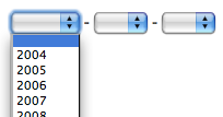
By default, the year select tag is populated with the 10 years around the
current year. This can be changed by using the years option:
$years = range(2009, 2020);
$w = new sfWidgetFormDate(
  array('years' => array_combine($years, $years))
);
The years, months, and days options take an array where the keys are the
values of the option tags and the values are the strings displayed to the
user.
sfWidgetFormTime
The sfWidgetFormTime represents a time widget:

The values submitted by the user are stored in an array of the name of the widget:
$w = new sfWidgetFormTime();
$w->render('time');

# submitted values will be in a `time` array:
# array(
#   'time' => array(
#     'hour'    => 12,
#     'minute'  => 13,
#     'second'  => 14,
#   ),
# );
The behavior of the widget can be customized with a lot of options:
| Option | Description |
|---|---|
format |
The time format string (%hour%:%minute%:%second%) |
format_without_seconds |
The time format string without seconds (%hour%:%minute%) |
with_seconds |
Whether to include a select for seconds (false by default) |
hours |
An array of hours for the hour select tag (optional) |
minutes |
An array of minutes for the minute select tag (optional) |
seconds |
An array of seconds for the second select tag (optional) |
can_be_empty |
Whether the widget accepts an empty value (true by default) |
empty_values |
An array of values to use for the empty value |
(empty string for hours, minutes, and seconds by default) |
By default, the widget does not allow for the selection of seconds. This can be
changed by setting the with_seconds option to true:
$w = new sfWidgetFormTime(array('with_seconds' => true));
Using the format and format_without_seconds options allows the
customization of the default tags arrangement (the %hour%, %minute%, and
%second% placeholder are replaced by the corresponding select tag when the
render() method is called):
$w = new sfWidgetFormTime(array(
  'with_seconds' => true,
  'format'       => '%hour% : %minute% : %second%',
));

If you don't want to propose every minute or second, you can provide your own values for each of the three tags:
$seconds = array(0, 15, 30, 45);
$w = new sfWidgetFormTime(array(
  'with_seconds' => true,
  'seconds'      => array_combine($seconds, $seconds),
));
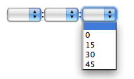
The hours, minutes, and seconds options take an array where the keys are
the values of the option tags and the values are the strings displayed to
the user.
sfWidgetFormDateTime
The sfWidgetFormDateTime widget is a widget that renders two sub-widgets: a
sfWidgetFormDate widget and a sfWidgetFormTime one:
$w = new sfWidgetFormDateTime();

| Option | Description |
|---|---|
date |
Option for the date widget (see sfWidgetFormDate) |
time |
Option for the time widget (see sfWidgetFormTime) |
with_time |
Whether to include time (true by default) |
format |
The format string for the date and the time widget |
(default to %date% %time%) |
tip
By default, the widget creates instances of sfWidgetFormDate and
sfWidgetFormTime for the date and the time widgets respectively. You
can change the classes used by the widget by overriding the
getDateWidget() and the getTimeWidget() methods.
sfWidgetFormI18nDate
The sfWidgetFormI18nDate extends the standard sfWidgetFormDate widget. But
whereas the standard widget displays months as numbers, the i18n one displays
them as strings, localized according to a culture:
$w = new sfWidgetFormI18nDate(array('culture' => 'fr'));
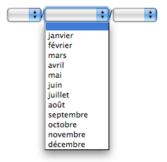
The month string formatting can be tweaked with the month_format option. It
accepts three values: name (the default), short_name, or number.
$w = new sfWidgetFormI18nDate(array(
  'culture'      => 'fr',
  'month_format' => 'short_name',
));
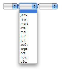
According to the culture, the widget also knows the order of the three different select boxes and the separator to use between them.
caution
This widget depends on the symfony i18n sub-framework.
sfWidgetFormI18nTime
The sfWidgetFormI18nTime extends the standard sfWidgetFormTime widget.
According to the culture passed as an option, the widget knows the order of
the three different select boxes and the separator to use between them:
$w = new sfWidgetFormI18nTime(array('culture' => 'ar'));

caution
This widget depends on the symfony i18n sub-framework.
sfWidgetFormI18nDateTime
The sfWidgetFormI18nDateTime widget is a widget that renders two
sub-widgets: a sfWidgetFormI18nDate widget and a sfWidgetFormI18nTime one.
caution
This widget depends on the symfony i18n sub-framework.
sfWidgetFormDateRange
The sfWidgetFormDateRange widget represents a choice of a range of dates:
$w = new sfWidgetFormDateRange(array(
  'from_date' => new sfWidgetFormDate(),
  'to_date'   => new sfWidgetFormDate(),
));

| Option | Description |
|---|---|
from_date |
The from date widget (required) |
to_date |
The to date widget (required) |
template |
The template to use to render the widget |
(available placeholders: %from_date%, %to_date%) |
The template used to render the widget can be customized with the template
option:
$w = new sfWidgetFormDateRange(array(
  'from_date' => new sfWidgetFormDate(),
  'to_date'   => new sfWidgetFormDate(),
  'template'  => 'Begin at: %from_date%<br />End at: %to_date%',
));

note
This widget is the base class for the more sophisticated
sfWidgetFormFilterDate widget.
sfWidgetFormJQueryDate
The sfWidgetFormJQueryDate widget represents a date widget rendered by
JQuery UI:
$w = new sfWidgetFormJQueryDate(array(
  'culture' => 'en',
));
caution
This widget is part of the sfFormExtraPlugin symfony plugin. As
JQuery and JQuery UI are not bundled with sfFormExtraPlugin, you need
to install and include them by hand.
| Option | Description |
|---|---|
image |
The image path to represent the widget (false by default) |
config |
A JavaScript array that configures the JQuery date widget |
culture |
The user culture |
I18n Widgets
caution
The widgets in this section depend on the symfony i18n sub-framework.
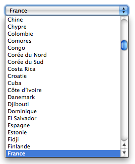
sfWidgetFormI18nChoiceCountry
The sfWidgetFormI18nChoiceCountry represents a choice of countries:
$w = new sfWidgetFormI18nChoiceCountry(array('culture' => 'fr'));
| Option | Description |
|---|---|
culture |
The culture to use for internationalized strings (default: en) |
countries |
An array of country codes to use (ISO 3166) |
add_empty |
Whether to add a first empty value or not (false by default) |
| If the option is not a Boolean, the value will be used as the text value. |
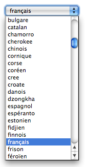
sfWidgetFormI18nChoiceLanguage
The sfWidgetFormI18nChoiceLanguage represents a choice of languages:
$w = new sfWidgetFormI18nChoiceLanguage(array('culture' => 'fr'));
| Option | Description |
|---|---|
culture |
The culture to use for internationalized strings (default: en) |
languages |
An array of language codes to use |
add_empty |
Whether to add a first empty value or not (false by default) |
| If the option is not a Boolean, the value will be used as the text value. |
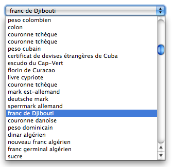
sfWidgetFormI18nChoiceCurrency
The sfWidgetFormI18nChoiceCurrency represents a choice of currencies:
$w = new sfWidgetFormI18nChoiceCurrency(array('culture' => 'fr'));
| Option | Description |
|---|---|
culture |
The culture to use for internationalized strings (required) |
currencies |
An array of currency codes to use |
add_empty |
Whether to add a first empty value or not (false by default) |
| If the option is not a Boolean, the value will be used as the text value. |
sfWidgetFormI18nChoiceTimezone
The sfWidgetFormI18nChoiceTimezone represents a choice of timzones:
$w = new sfWidgetFormI18nChoiceTimezone(array('culture' => 'fr'));
| Option | Description |
|---|---|
culture |
The culture to use for internationalized strings (default: en) |
add_empty |
Whether to add a first empty value or not (false by default) |
| If the option is not a Boolean, the value will be used as the text value. |
Captcha Widget
The sfFormExtraPlugin plugin comes with a captcha widget,
sfWidgetFormReCaptcha, based on the
ReCaptcha project:
$w = new sfWidgetFormReCaptcha(array(
  'public_key' => 'RECAPTCHA_PUBLIC_KEY'
));
| Option | Description |
|---|---|
public_key |
The ReCaptcha public key |
use_ssl |
Whether to use SSL or not (false by default) |
server_url |
The URL for the HTTP API |
server_url_ssl |
The URL for the HTTPS API (only used when use_ssl is true) |
The public_key is the ReCaptcha public key. You can obtain one for free by
signing for an API key.
tip
More information about the ReCaptcha API can be found online.
As it is not possible to change the name of the ReCaptcha fields, you will have to add them manually when binding a form from an HTTP request.
For instance, if your form has a contact[%s] name format, here is the needed
code to ensure that the captcha information will be merged with the rest of
the form submitted values:
$captcha = array(
  'recaptcha_challenge_field' => $request->getParameter('recaptcha_challenge_field'),
  'recaptcha_response_field'  => $request->getParameter('recaptcha_response_field'),
);
$submittedValues = array_merge(
  $request->getParameter('contact'),
  array('captcha' => $captcha)
);
This widget is to be used with the sfValidatorReCatpcha validator.
Filter Widgets
Filter widgets are special widgets that can be used to render a form that acts as a filter.
sfWidgetFormFilterInput
sfWidgetFormFilterInput represents a filter for text. By default, it
includes a checkbox to allow users to search for empty text.
| Option | Description |
|---|---|
with_empty |
Whether to add the empty checkbox (true by default) |
empty_label |
The label to use when using an empty checkbox |
template |
The template to use to render the widget |
Available placeholders: %input%, %empty_checkbox%, %empty_label% |
sfWidgetFormFilterDate
sfWidgetFormFilterDate represents a widget to filter a range of date. By
default, it includes a checkbox to allow users to search for empty dates.
| Option | Description |
|---|---|
with_empty |
Whether to add the empty checkbox (true by default) |
empty_label |
The label to use when using an empty checkbox |
template |
The template to use to render the widget |
Available placeholders: %date_range%, %empty_checkbox%, %empty_label% |
sfWidgetFormSchema
The sfWidgetFormSchema widget represents a widget which is composed of
several fields. A field is simply a named widget:
$w = new sfWidgetFormSchema(array(
  'name'    => new sfWidgetFormInputText(),
  'country' => new sfWidgetFormI18nChoiceCountry(),
));
note
A form is defined by a widget schema of class sfWidgetFormSchema.
The sfWidgetFormSchema constructor takes five optional arguments:
- An array of fields
- An array of options
- An array of HTML attributes
- An array of labels for the embedded widgets
- An array of help messages for the embedded widgets
The available options are:
| Option | Description |
|---|---|
name_format |
The sprintf pattern to use for input names (%s by default) |
form_formatter |
The form formatter name (table and list are bundled, table is the default) |
If you want to change the default formatter for all forms, you can set the
setDefaultFormFormatterName() method:
sfWidgetFormSchema::setDefaultFormFormatterName('list');
As the sfWidgetFormSchema extends the sfWidgetForm class, it inherits all
its methods and behaviors.
caution
A sfWidgetFormSchema object only renders the "rows" of widgets, not
the container tag (table for a table formatter, or ul for the
list one):
<Table>
  <?php echo $ws->render('') ?>
</table>
The sfWidgetFormSchema can be used as an array to access the embedded
widgets:
$ws = new sfWidgetFormSchema(array('name' => new sfWidgetFormInputText()));

$nameWidget = $ws['name'];

unset($ws['name']);
caution
When a widget form schema is embedded in a form, the form gives you access to a bound field in the templates, not to the widget itself. See the form reference chapter for more information.
As a widget schema is a widget like any other, widget schemas can be nested:
$ws = new sfWidgetFormSchema(array(
  'title'  => new sfWidgetFormInputText(),
  'author' => new sfWidgetFormSchema(array(
    'first_name' => new sfWidgetFormInputText(),
    'last_name'  => new sfWidgetFormInputText(),
  )),
));
You can access embedded widget schema widgets by using the array notation:
$ws['author']['first_name']->setLabel('First Name');
Below, the main methods of widget schema classes are described. For a full list of methods, refer to the online API documentation.
setLabel(), getLabel(), setLabels(), getLabels()
The setLabel(), getLabel(), setLabels(), and getLabels() methods
manages the labels for the embedded widgets. They are proxy methods for the
getLabel() and setLabel() widget methods.
$ws = new sfWidgetFormSchema(array('name' => new sfWidgetFormInputText()));

$ws->setLabel('name', 'Fabien');

// which is equivalent to

$ws['name']->setLabel('Fabien');

// or

$ws->setLabels(array('name' => 'Fabien'));
The setLabels() method merges the values with the existing ones.
setDefault(), getDefault(), setDefaults(), getDefaults()
The setDefault(), getDefault(), setDefaults(), and getDefaults()
methods manages the default values for the embedded widgets. They are proxy
methods for the getDefault() and setDefault() widget methods.
$ws = new sfWidgetFormSchema(array('name' => new sfWidgetFormInputText()));

$ws->setDefault('name', 'Fabien');

// which is equivalent to

$ws['name']->setDefault('Fabien');

// or

$ws->setDefaults(array('name' => 'Fabien'));
The setDefaults() method merges the values with the existing ones.
setHelp(), setHelps(), getHelps(), getHelp()
The setHelp(), setHelps(), getHelps(), and getHelp() methods manages
the help message associated with embedded widgets:
$ws = new sfWidgetFormSchema(array('name' => new sfWidgetFormInputText()));

$ws->setHelp('name', 'Fabien');

// which is equivalent to

$ws->setHelps(array('name' => 'Fabien'));
The setHelps() method merges the values with the existing ones.
getPositions(), setPositions(), moveField()
The fields contained in a widget schema are ordered. The order can be changed
with the moveField() method:
$ws = new sfWidgetFormSchema(array(
  'first_name' => new sfWidgetFormInputText(),
  'last_name' => new sfWidgetFormInputText()
));

$ws->moveField('first_name', sfWidgetFormSchema::AFTER, 'last_name');
The constants are the following:
sfWidgetFormSchema::FIRSTsfWidgetFormSchema::LASTsfWidgetFormSchema::BEFOREsfWidgetFormSchema::AFTER
It is also possible to change all positions with the setPositions() method:
$ws->setPositions(array('last_name', 'first_name'));
sfWidgetFormSchemaDecorator
The sfWidgetFormSchemaDecorator widget is a proxy widget schema which wraps
a form schema widget inside a given HTML snippet:
$ws = new sfWidgetFormSchema(array('name' => new sfWidgetFormInputText()));

$wd = new sfWidgetFormSchemaDecorator($ws, '<table>%content%</table>');
note
This widget is used internally by symfony when a form is embedded into another.
This work is licensed under the Creative Commons Attribution-Share Alike 3.0 Unported License license.